pieChart
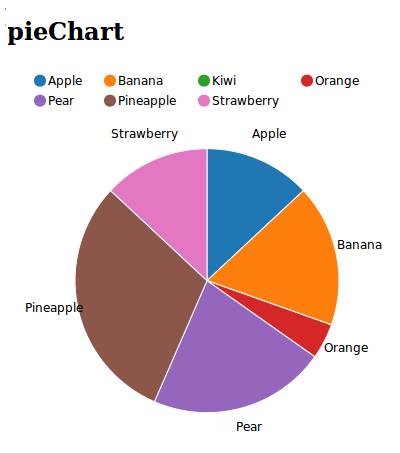
A pie chart (or a circle graph) is a circular chart divided into sectors, illustrating numerical proportion. In chart, the arc length of each sector is proportional to the quantity it represents.
Django example:
from django.shortcuts import render_to_response
import random
import datetime
import time

def demo_piechart(request):
    """
    pieChart page
    """
    xdata = ["Apple", "Apricot", "Avocado", "Banana", "Boysenberries", "Blueberries", "Dates", "Grapefruit", "Kiwi", "Lemon"]
    ydata = [52, 48, 160, 94, 75, 71, 490, 82, 46, 17]

    extra_serie = {"tooltip": {"y_start": "", "y_end": " cal"}}
    chartdata = {'x': xdata, 'y1': ydata, 'extra1': extra_serie}
    charttype = "pieChart"

    data = {
        'charttype': charttype,
        'chartdata': chartdata,
    }
    return render_to_response('piechart.html', data)
Template example:
{% load static %}
<link media="all" href="{% static 'nvd3/src/nv.d3.css' %}" type="text/css" rel="stylesheet" />
<script type="text/javascript" src='{% static 'd3/d3.min.js' %}'></script>
<script type="text/javascript" src='{% static 'nvd3/nv.d3.min.js' %}'></script>

{% load nvd3_tags %}
<head>
    {% load_chart charttype chartdata "piechart_container" %}
</head>
<body>
    <h1>Fruits vs Calories</h1>
    {% include_container "piechart_container" 400 500 %}
</body>